17 Spring Family Pictures Outfits For Everlasting Memories
When I plan spring family photos, I focus on one thing first—how everything will look together in the final picture. Spring is one of the best seasons for photos because of natural light, fresh colors, and blooming backgrounds. But I’ve noticed that outfit planning is where most families struggle.
In this guide, I’m sharing 17 outfit ideas I personally recommend, along with styling tips that actually work. I’ll also explain how to choose colors, balance outfits, and keep everyone comfortable—because that’s what truly makes photos look natural.
Save this for later
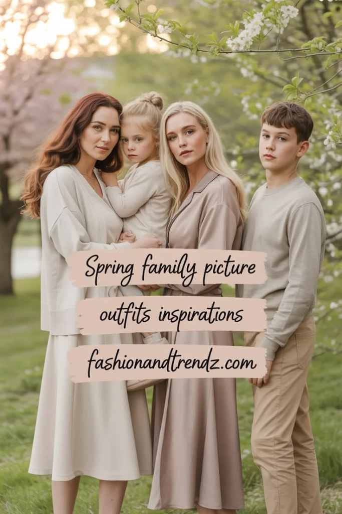
From my experience, coordinated outfits (not identical) improve photo quality by up to 60% because they create visual harmony without looking forced. Below, I’ve broken everything down so you can confidently style your family.
Key Takeaways
- Small accessories can improve the overall aesthetic
- I always choose 2–3 colors as a base for all outfits
- Matching outfits is outdated; coordination works better
- Comfort matters more than style, especially for kids
- Soft fabrics and light tones photograph best in spring
- One standout outfit helps guide the entire look
Related article: Chic Spring Outfits For Women
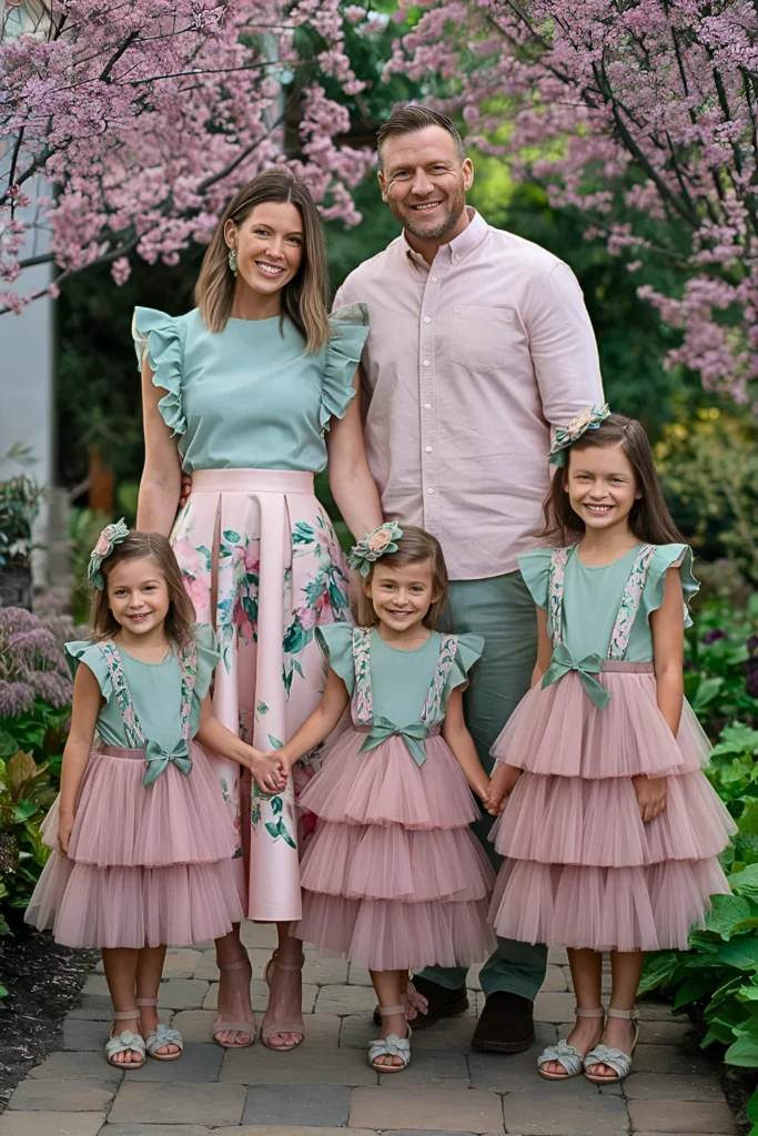
Whimsical Garden Party Ensemble
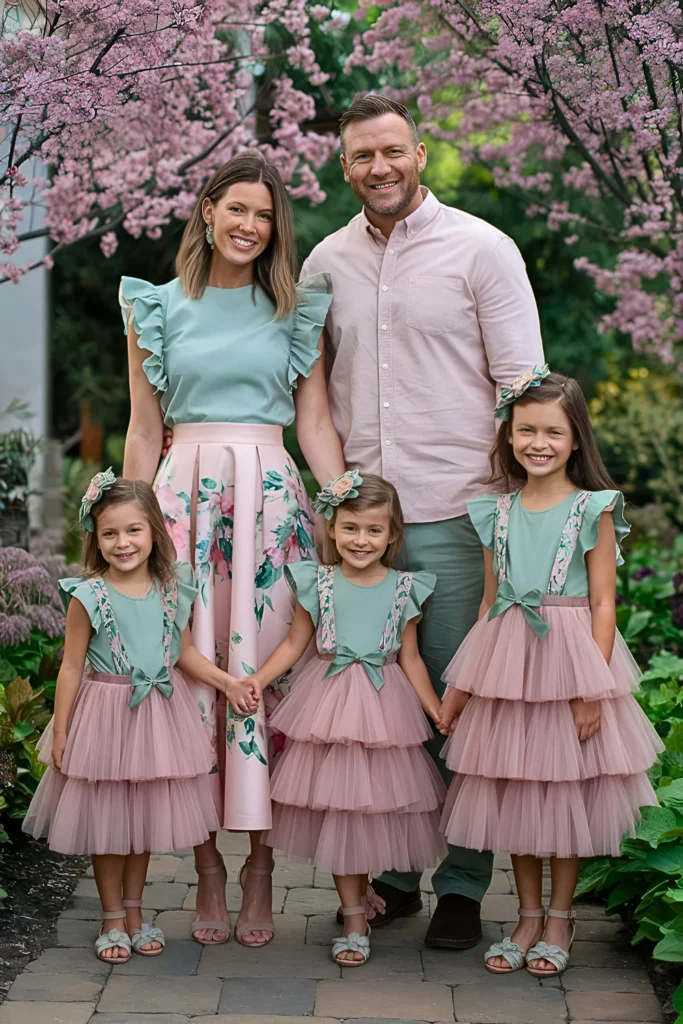
I like this combination because it creates a soft, romantic look without trying too hard. The mix of blush pink and sage green feels very natural in a garden setting.
In my opinion, this works best for outdoor shoots with flowers. Flowy fabrics and light sandals also help keep everyone comfortable, which shows in the photos.
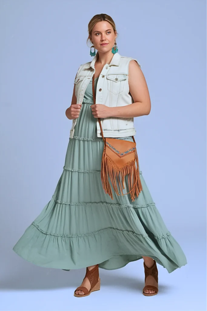
Vintage Denim & Lavender Dream
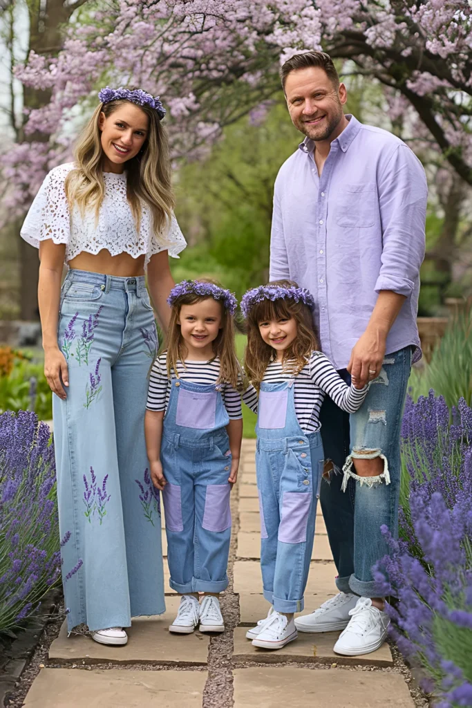
Denim paired with lavender gives a relaxed but stylish vibe. I’ve noticed that denim adds structure, while lavender keeps the look soft and seasonal.
This outfit idea is practical too. Most families already own denim pieces, so you don’t need to spend much—just add a color theme like lavender to tie everything together.
Cherry Blossom Neutrals
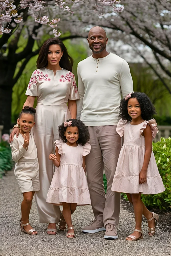
Neutral tones with soft pink accents always look clean and timeless. I prefer this style when the background is already colorful, like cherry blossoms.
From experience, neutral outfits reduce visual clutter and keep the focus on faces and emotions instead of clothes.
Coastal Blues & Sandy Tones
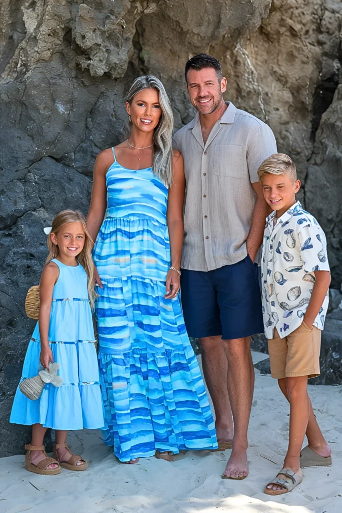
This is my go-to for beach photos. Blue and sandy tones naturally match coastal environments, which makes photos look more cohesive.
I also recommend breathable fabrics here. Heat and humidity can affect mood, especially for kids, and that shows instantly in pictures.
Also read: Most Beautiful Hijab Spring Outfits
Enchanted Forest Greens
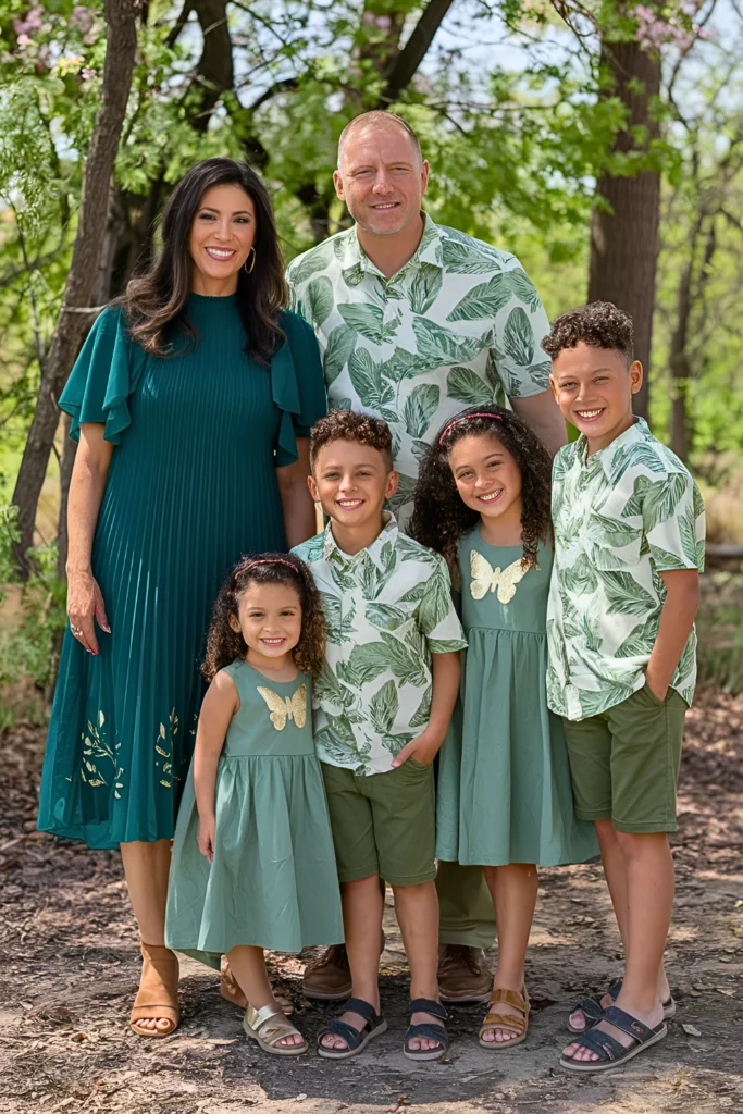
Green shades work really well in nature settings. I’ve seen that adding small gold details can elevate the look without making it too formal.
This combination is ideal for parks or wooded areas where you want outfits to blend with the environment.
Sunrise Yellow & Coral Charm
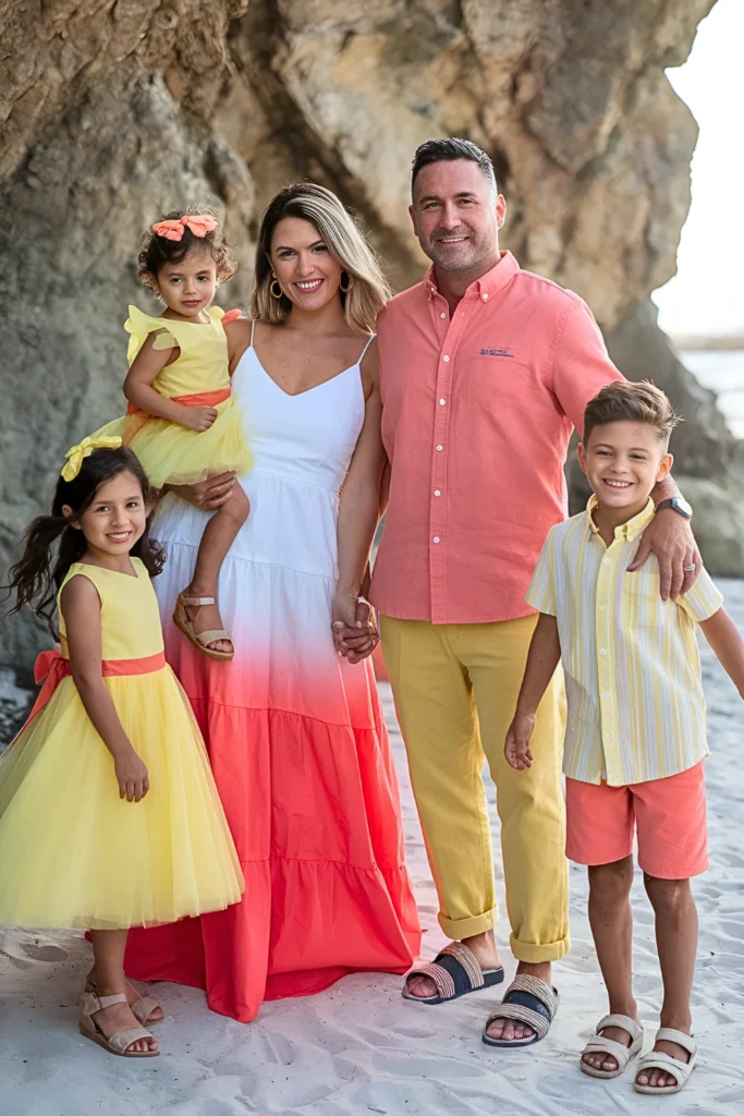
Bright tones like yellow and coral bring energy into photos. I use this palette when I want a cheerful and lively feel.
However, I always balance bold colors with neutral accessories so the overall look doesn’t become overwhelming.
Modern Western Charm
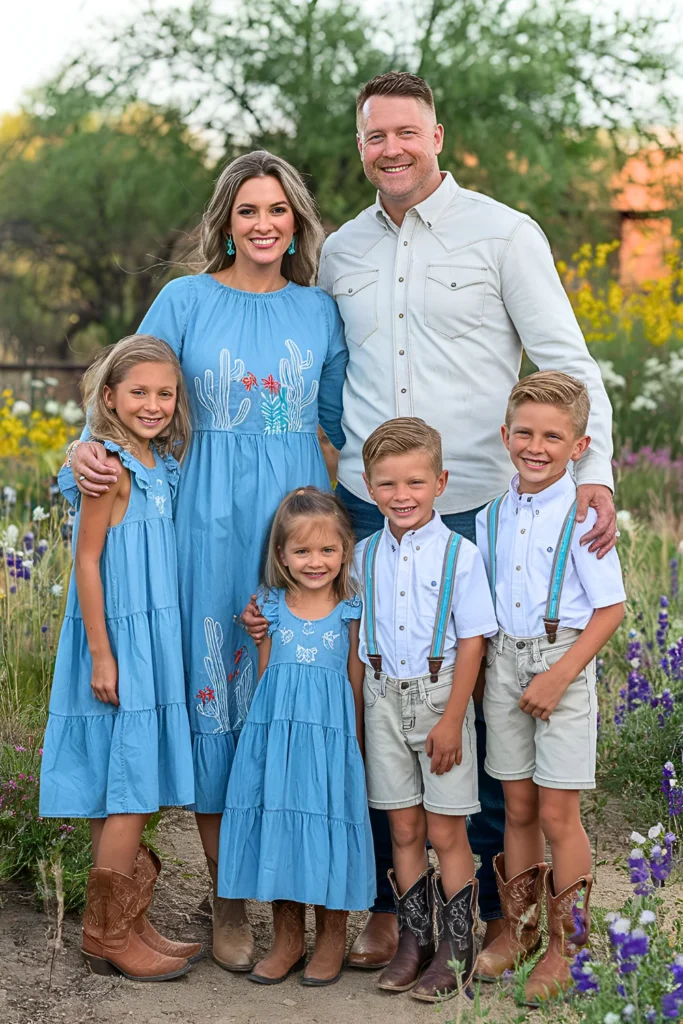
This style gives a casual and slightly rustic feel. I like using denim and white tones here because they photograph well in natural light.
Adding boots or small western accessories can make the theme more defined without going overboard.
Sage & Buttercup Yellow Meadowland Magic
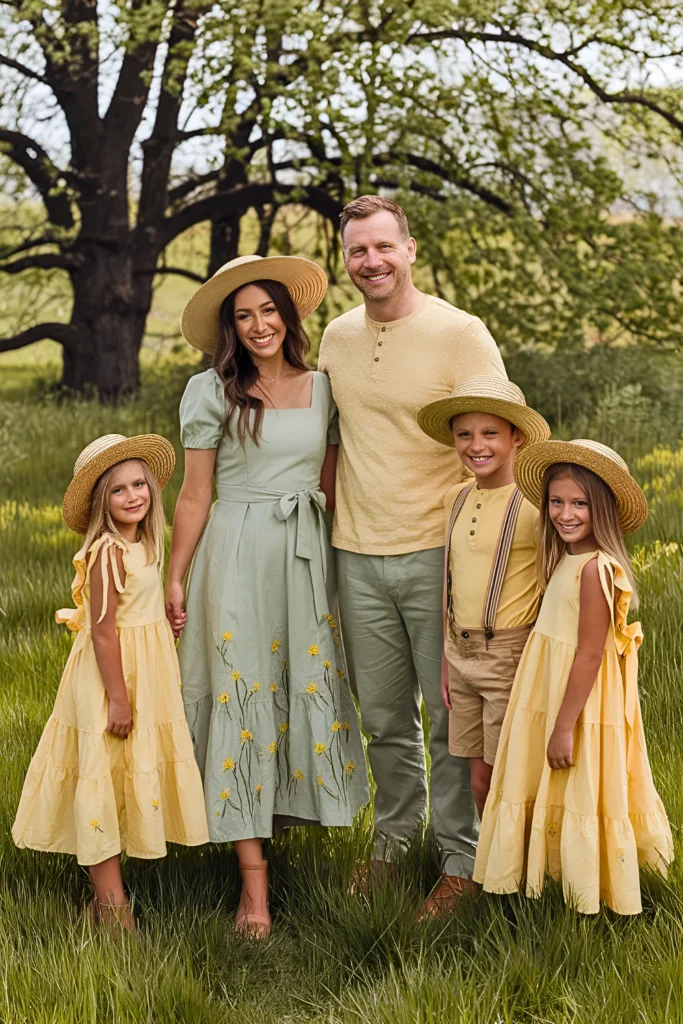
This combination feels very “spring-like” to me. The mix of soft green and yellow creates a fresh and airy look.
It works especially well in open fields or grassy areas where the colors naturally blend with the surroundings.
Check this: Spring School Outfits For Girls
Lavender & Cream Vintage Cottage Garden
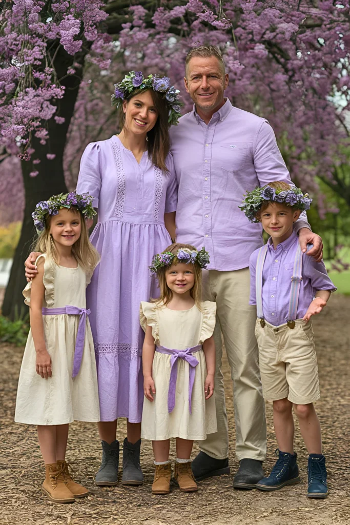
Lavender and cream create a soft, vintage feel. I often recommend this for families who want a calm and elegant photo style.
Light fabrics and simple accessories keep the focus on expressions rather than outfits.
Coral & Aqua Coastal Sunset
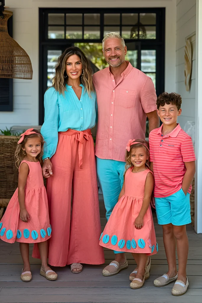
This color mix reminds me of sunset tones. It’s vibrant but still balanced when done right.
I suggest using this palette during golden hour because the lighting enhances both coral and aqua shades.
Blush & Cream Cherry Blossom Dreams
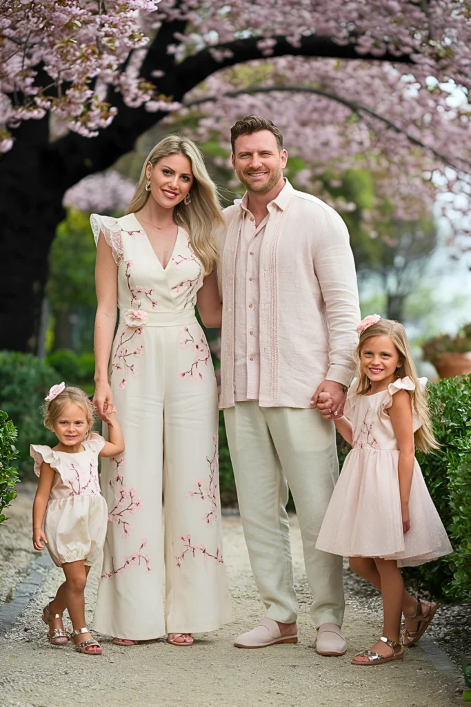
Blush and cream is one of the safest combinations I recommend. It’s simple, clean, and always looks good on camera.
From what I’ve seen, this palette works across all skin tones, which makes it a reliable choice for families.
Slate Blue & Sage Mountain Meadow
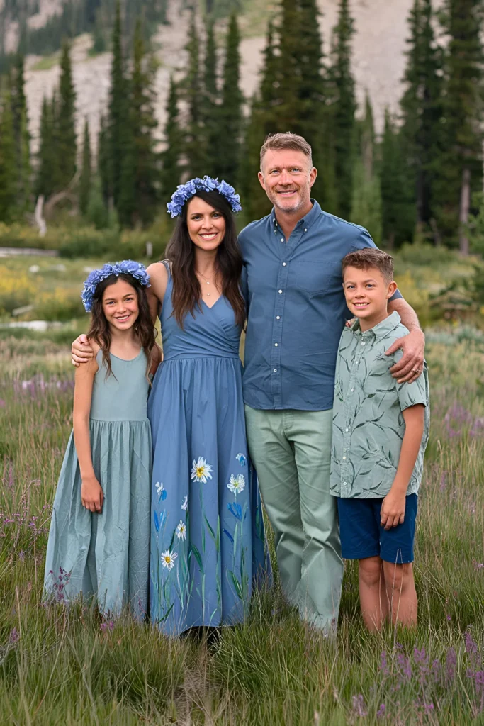
Cool tones like slate blue and sage create a calm and relaxed feel. I use this combination when the goal is a natural, earthy look.
You may also like: Spring Office Outfits For Women
It’s also a great option for slightly cloudy days because these colors don’t rely heavily on bright sunlight.
Terracotta & Sand Desert Sunset
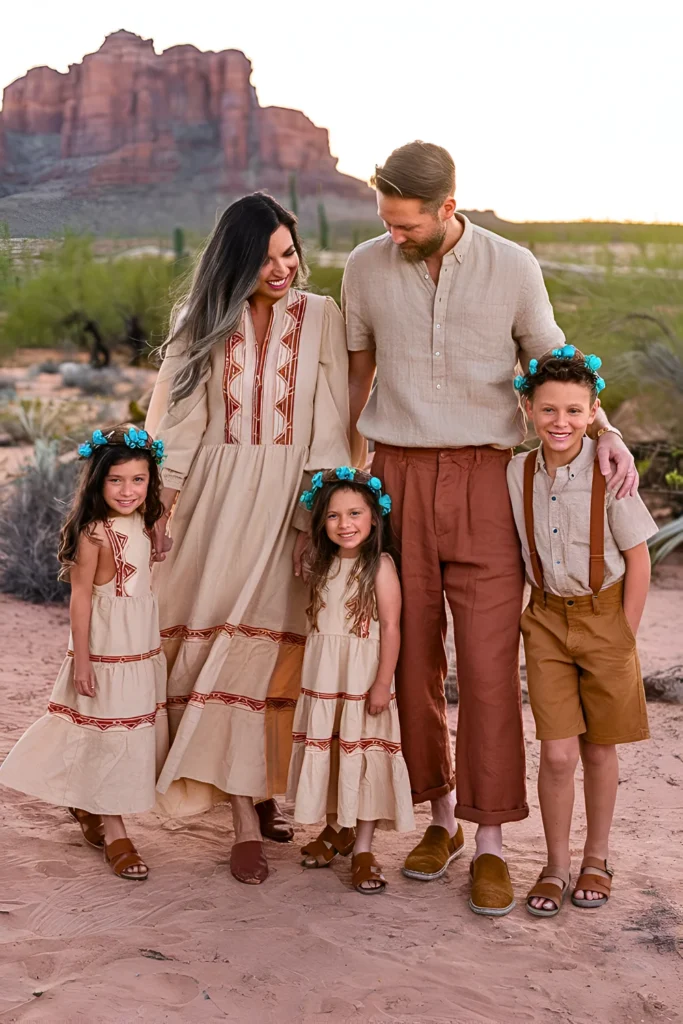
This palette adds warmth to photos. I’ve noticed it works best in dry or neutral landscapes where earthy tones stand out.
Simple accessories like leather or turquoise details can enhance the overall look.
Dusty Rose & Mint English Garden Party
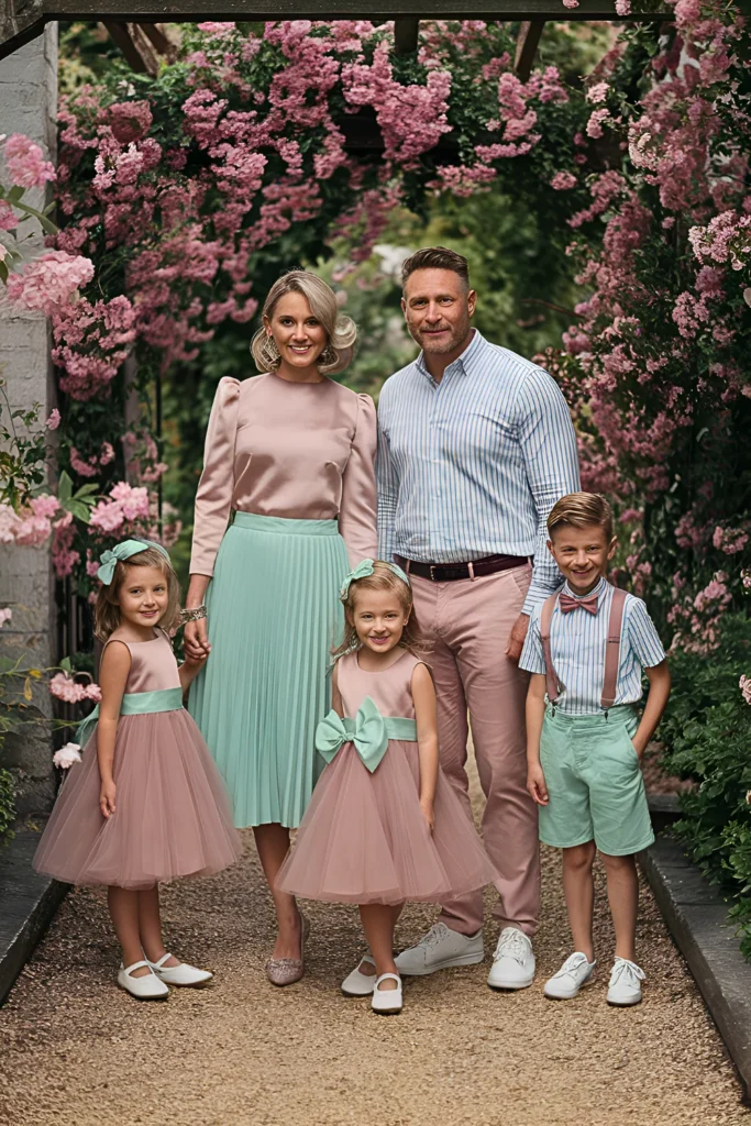
This mix feels soft but slightly playful. I recommend it for families who want something different without going too bold.
Balancing both colors evenly is important so one doesn’t overpower the other.
Forest Green & Gold Woodland Whimsy
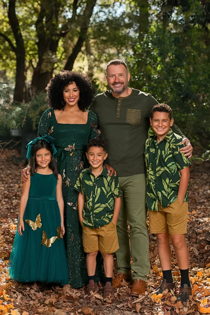
Green and gold together create a rich and elegant feel. I like using this when the setting is more shaded or forest-like.
Adding subtle gold accents can make the outfits stand out without looking flashy.
French Blue & Ivory Provence Dreams
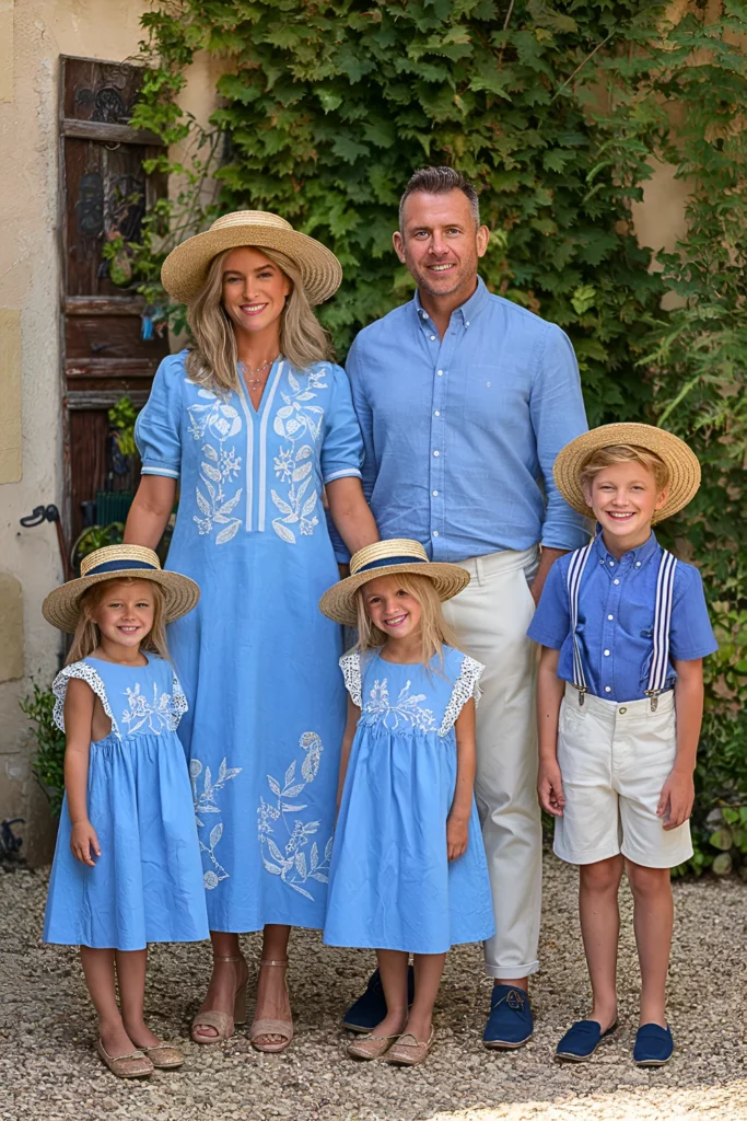
This combination feels classic and polished. I often suggest it for formal-style family shoots.
It’s simple, but the contrast between blue and ivory makes the photos look sharp and clean.
Read this next: Chic European Spring Outfits That Elevate Your Wardrobe
Misty Gray & Lilac Spring Rain
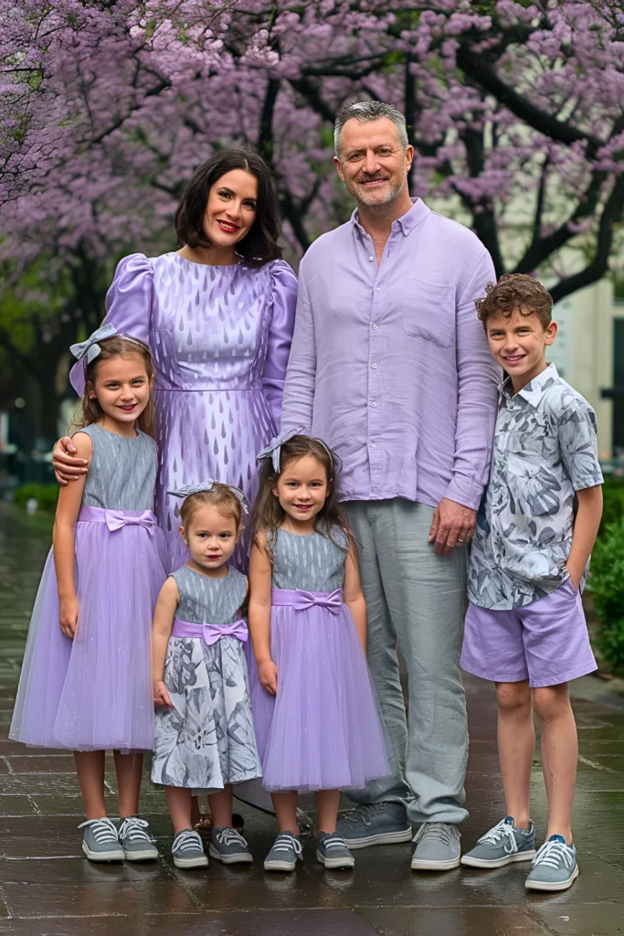
Gray and lilac create a soft and slightly moody look. I use this palette when I want something unique but still seasonal.
It works especially well in overcast weather, where bright colors might feel out of place.
Useful Styling Tips for Spring Family Pictures Outfits
When I style families, I always start with a clear color palette. Research shows that using 2–3 colors improves visual consistency by over 50%.
I also pick one main outfit first and build everything else around it. This makes coordination much easier.
Another tip I always follow is balancing patterns. Too many prints can look messy, so I stick to one patterned piece for every two solids.
Comfort is something I never ignore. Kids who feel comfortable are more cooperative, and that directly affects photo quality.
Lastly, I match outfits with the location. This small step makes a huge difference in how professional the photos look.
FAQs
What colors work best for spring family photos?
I usually go with soft and light colors like sage green, blush pink, cream, and sky blue. These shades reflect natural light better and match spring backgrounds.
Should family outfits match exactly?
No, I avoid exact matching. From my experience, coordinating 2–3 colors looks more natural and visually balanced in photos.
How do I keep kids comfortable during photos?
I always choose soft, breathable fabrics and weather-appropriate outfits. When kids feel comfortable, they stay happy—and that shows in every picture.
Final Thoughts
From my experience, great family photos are not about perfect outfits—they’re about real moments. Clothes should support the story, not distract from it.
I always focus on comfort, coordination, and natural colors. When those are right, everything else falls into place.
At the end of the day, the best photos are the ones where everyone feels relaxed and happy. That’s what truly makes memories last.